Content Research

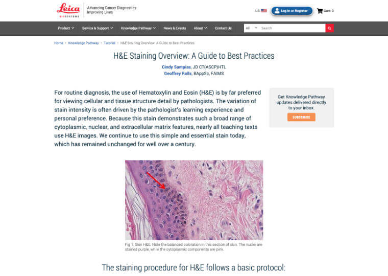
'Knowledge Pathway' is a knowledge portal of pathology industry thought leaders producing a wealth of great content that isn't just SEO boosting material (though it did great work at that too). It was an excellent resource of information, some of it used in academic settings and read by anybody from students, to laboratory technicians, to managers, to pathologists, to the c-suite in institutions large and small. This is a broad range of individuals, but we didn't have a lot of insight into their browsing behaviors and how they differed from one person to the next.
A slower experience
In the cancer diagnostics industry, it’s important to get results as fast as possible. Patients are waiting, and those in the lab need the equipment and supplies equally as fast to get those results. When it comes to accomplishing the task of ordering supplies from the e-commerce website, the research was clear…our users are busy. They are under pressure to deliver results that are quite literally a matter of life and death.
However, with Knowledge Pathway, the goal was to slow them down. The content here was not the easiest reading for the lay person, but the information was important, effectively a knowledge-base of shared learnings in an area of study that is complex and ever-evolving. I was approached by the key stakeholders who were responsible for this section of the website to investigate content consumption habits, and what learnings and recommendations could be applied to improve engagement across the platform.
I began this research spike by engaging with the stakeholders to get a broad idea of what they were looking for out of this research. What business questions did we want to resolve? It turns out this was a research project of its own, as there didn’t seem to be consensus, and some stakeholders had different ideas of what questions were relevant. I began theming this as I would user research, and was able to isolate the concerns to a few key themes that were very high level and tactical. This helped shape the research plan and what methods I would use.
Don’t boil the ocean
Before I began recruiting for the end-user interviews, I brought the team together for a slightly longer kickoff session to ensure everyone was aligned on the research goals. One thing I had to stress was that this was not meant to “validate” a particular decision, but to gather input on browsing habits and offer recommendations based on those findings. I didn’t want to approach these sessions by biasing them towards certain attitudes that would only serve to confirm biases. After some healthy debate, we came to alignment with the project goals and, importantly, focus.
I began sourcing interview participants from across the globe (unlike the e-commerce replatform, this project touched the “core” website and covered more than the US, and our content was read by English speakers/readers from North America, Europe, Africa, and the Asia-Pacific region). In speaking with stakeholders in more direct one-on-one interviews, I received a broad range of roles to source, and was able to get in touch with students, laboratory managers, cancer researchers, and some individuals who owned their own practices. This required dedicated interview guides for each with targeted questions. The findings were varied in their own unique ways, as expected, but some consistent themes seemed to emerge. A critical one was COVID’s impact on the time many of these people usually allotted themselves to do this self-study.
I noticed that some people approached their content consumption as “hunters”, looking for something very specific and relying on site tools and features to get them to what they need more quickly. Conversely, while there were fewer of these folks than the hunters, some others approached their habits as “explorers”, using the platform to seek out information in a more carefree and less linear manner. Granted, some users spoke to having less time for this, but it was still of importance. Discoverability was as critical as findability.
During these sessions, I also ran these participants through some content-usability testing across our site as well as two of our competitors who have similar knowledge-base platforms. All told, they appreciated the substance of our content the most (props to our content team who write excellent material), where one user exclaimed specifically at a photo that was used in one article of an unorthodox method that lab techs sometimes used. However, the experience surrounding the content was arduous. The content was not structured well, the interface was inconsistent and a chore to navigate, and users had a hard time maintaining the information scent as they navigated through the environment.
In-progress
While this research was conducted towards the end of my tenure at Leica Biosystems and not everything came to fruition before I had left, I still delivered a report-out with recommendations as well as next steps for the team to undertake in my stead. An information architecture runthrough would be required, and I helped get this started while training the team on how to carry this forward in my absence until a replacement was brought on board. Improved interface navigation would also be critical, and I engaged with some of the designers on the brand team as well as an incoming digital designer to give them background in improving the interface.
